Backward compatible Dark Mode on iOS
September 25, 2019
#swift
#dark mode
#ui
Earlier this year Apple announced Dark Mode on iOS, that offers an option for a user to choose a system-wide light or dark appearance. It is available starting from iOS 13. But if you aren’t that lucky with the iOS adoption rate, there is still a need to support older versions of iOS. In this article let’s take a look at how we can introduce Dark Mode that works on all iOS versions including iOS 13.
Pre-requisites
It should be pointed out that adopting the Dark Mode(or Dark Theme) is not that trivial as it might look at a first glance. Thus there is some preparation required before you move forward. It makes sense bringing some structure to the UI code and defining the application-wide color palette, fonts, UI elements styles, etc.
I’d suggest watching the WWDC talk Implementing Dark Mode on iOS and checking documentation to get an overview of this feature and related changes introduced in UIKit. There is also a nice guide on how to get your app ready for Dark Mode posted at NSHipster.
Dark Mode before iOS 13
The first thing we should do is to declare a theme type. It defines a style that can be applied to the entire app and specifies appearance details of every view. The Theme struct contains a nested Type enum and two properties that store theme type and color palette:
struct Theme {
    enum `Type` {
        case light
        case dark
    }
    let type: Type
    let colors: ColorPalette
}
Let’s assume that we have a color palette defined in the project. We can create light and dark themes then:
extension Theme {
    static let light = Theme(type: .light, colors: .light)
    static let dark = Theme(type: .dark, colors: .dark)
}
To be able to update our UI components with the current theme there should be a protocol which all of those conform to. This can be achieved with a Themeable protocol:
protocol Themeable: class {
    func apply(theme: Theme)
}
Next we’ll need a way to keep track of the current application theme and provide an option to subscribe to the current theme changes. For that we’ll declare a ThemeProvider class which stores the current theme in the UserDefaults, keeps theme observers in NSHashTable and notifies those when the current theme gets changed:
class ThemeProvider {
    static let shared = ThemeProvider()
    var theme: Theme {
        didSet {
            UserDefaults.standard.set(theme == .dark, forKey: "isDark")
            notifyObservers()
        }
    }
    private var observers: NSHashTable<AnyObject> = NSHashTable.weakObjects()

    private init() {
        self.theme = UserDefaults.standard.bool(forKey: "isDark") ? .dark : .light
    }

    func toggleTheme() {
        theme = theme == .light ? .dark : .light
    }

    func register<Observer: Themeable>(observer: Observer) {
        observer.apply(theme: theme)
        self.observers.add(observer)
    }

    private func notifyObservers() {
        DispatchQueue.main.async {
            self.observers.allObjects
                .compactMap({ $0 as? Themeable })
                .forEach({ $0.apply(theme: self.theme) })
        }
    }
}
With the above-mentioned code in place we’re now ready to update our application and make it work in both dark and light modes. We can start with updating all UI components like view controllers, cells, controls, etc. to conform to the Themeable protocol and update its appearance in apply(theme:) method. To listen to the theme changes we should register observers by calling register(observer:) method from ThemeProvider class. It can be done for the view controllers as following:
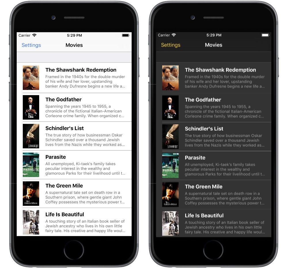
class MoviesTableViewController: UITableViewController {

    override func viewDidLoad() {
        super.viewDidLoad()
        themeProvider.register(observer: self)
    }
}

extension MoviesTableViewController: Themeable {
    func apply(theme: Theme) {
        // update UI attributes
    }
}
Apart from that, there should be a settings screen where user can turn the dark mode on and off. It could be done even nicer using Gagat library and having an interactive way to switch between two different themes in your iOS application using a two-finger pan. Finally we should get Dark Mode support for the application running on iOS 12.

Adopting Dark Mode in iOS 13
In iOS 13 Apple provided system-wide Dark Mode support. Now we can create colors and images in the asset catalog and specify a different appearance for Dark Mode. Eventually, when user turns on dark mode from the Settings, the application’s UI can be updated automatically. There might be the case when you want to detect appearance changes and update the UI accordingly. This could be done by implementing traitCollectionDidChange(_:) method in any UIKit class that conforms to UITraitEnvironment protocol. Taking all of this into account, we should make some adjustments in the current solution.
Leveraging dynamic colors we can define adaptive color palette and theme:
struct Theme {
    static let light = Theme(type: .light, colors: .light)
    static let dark = Theme(type: .dark, colors: .dark)
    @available(iOS 13.0, *)
    static let adaptive = Theme(type: .adaptive, colors: .adaptive)

    enum `Type` {
        case light
        case dark
        @available(iOS 13.0, *)
        case adaptive
    }
}
The ThemeProvider we’ve described before won’t work nicely for applications running on iOS 13. We can declare a new DefaultThemeProvider class and make both providers conform to the ThemeProvider protocol:
protocol ThemeProvider: class {
    var theme: Theme { get }
    func register<Observer: Themeable>(observer: Observer)
    func toggleTheme()
}

@available(iOS 13.0, *)
public class DefaultThemeProvider: NSObject, ThemeProvider {
    static let shared = DefaultThemeProvider()
    let theme: Theme = .adaptive

    private override init() {
        super.init()
    }

    func register<Observer: Themeable>(observer: Observer) {
        observer.apply(theme: theme)
    }

    func toggleTheme() {
        assertionFailure("The function \(DefaultThemeProvider.self).\(#function) shouldn't be used!")
    }
}
Next we’ll need a way to pick a ThemeProvider implementation based on the current iOS version:
extension Themeable where Self: UITraitEnvironment {
    var themeProvider: ThemeProvider {
        if #available(iOS 13.0, *) {
            return DefaultThemeProvider.shared
        } else {
            return LegacyThemeProvider.shared
        }
    }
}
With that implemented we should get Dark Mode support for the application running on iOS 13.

Conclusion
In this article we’ve explored how to make your app look great by implementing Dark Mode that works on all iOS versions including iOS 13. The solution we’ve described here could be easily extended to support more than two themes for applications running on iOS 12 and below. You can find the demo project’s source code on Github. Feel free to play around and reach me out on Twitter if you have any questions, suggestions or feedback.
Thanks for reading!